One of my favorite things in the world is paint.
With a new coat of paint, you can instantly change your mood, your outlook and even your life. Colors not only affect how you feel, they even influence physiological reactions. Therefore it’s so important to pick a color that is right just for YOU. When you start a design project, always ask yourself how you want to feel when you are in the space. Then start the process by selecting a color scheme that will evoke the emotions you want to feel.
When Curator Paints, a new paint company from Ireland, contacted me to collaborate using some of their dreamy colors I immideately thought of this Santa Monica apartment project.

The apartment functions as a part office, part calming sanctuary with a direct view of the Pacific. I wanted to bring in all the soothing and earthy colors you see right outside the window. The ocean, sky, palm trees, lawns and the miles long sand beach all had to be part of the color scheme.
Nothing is more peaceful than “hint” blue walls, so I selected a color that would catch the shifting color of the sky. SOFT DAY by Curator Paints is the most soothing hue!


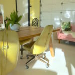
As a center piece we found a 70’s style vintage cabinet with lots of details and painted it the color of the dark ocean. GLASS HEAD PINS from Curator Paints is a dreamy deep blue color.
Cabinet before:


Here are some progress pictures…
Testing some paint samples:

The pale blue color with the view:

First coat of paint!


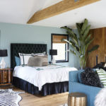
Some pillow covers from Etsy. The color scheme has an earthy quality.


For the headboard we used the grey MONTEREY HEADBOARD with antique brass nail heads.

The beautiful Susan Lamp in Indigo.

For the bed our new JSL LUX bedding in sand. It’s a bold, modern look.


Bubba of course came along for the shoot with Pam and Kaitlyn from Jill Sorensen Lifestyle. As always, he was the perfect model.:)


We we are thrilled with how peaceful and soothing the bedroom looks.
Thank You to to the team at Curator Paints for a fun collaboration.
You can view Curator Paints full color palette HERE
You can find a retailer who carries them near you HERE

P.S. For more inspiration and tips follow along on Instagram @jillsorensenlifestyle

