Do you love or hate picking a paint color? It’s often the thing that keep people from finishing, or even starting their home design. First you can’t decide on a color, then when after much difficulty you find the color you want to paint, you can’t decide on what hue of that color!!! And you know if the colors are off or wrong, it doesn’t matter how pretty or expensive your furniture is – it’s going to look bad. I normally pick a color pretty quickly, but somehow when it came to my living room, I got indecisive.
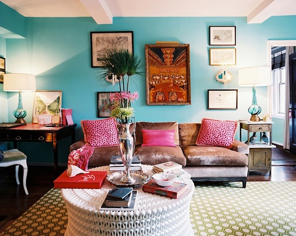
The first step I always make when selecting a color is look at the surrounding rooms. All wall colors have to flow together. The living room has double height ceiling and is the center of the house, so picking the right color was important. I decided on a minty green and finished a design scheme around it. Only to change my mind when I was reading Lonny Magazine…
Looking at this – mint green was out the window!! The color is very strong for a room with double height ceiling, but I kept coming back to it. I loved it mixed with green plants, brown, black and pink.
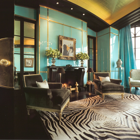
Then I remembered another image I was always drawn to that had nothing do to with what I wanted the room to look like….
But I loved the mix of color. Turquoise with gold/yellow!
Blue can tend to be cold unless you mix it with warmer tones. So I started thinking of ways I could warm it up. Curtains represent a big block of color. Like hair on a person!! haha
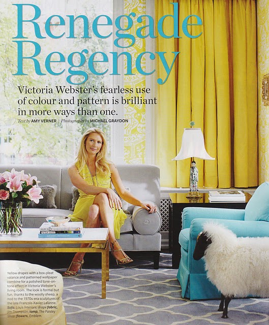
So I started thinking about bold yellow curtains. I love yellow.
I liked how the yellow curtains in in this room looked with the turquoise chair.
Then I did a quick inventory of the furniture that would stay. I imagined how they would look with turquoise as a backdrop.
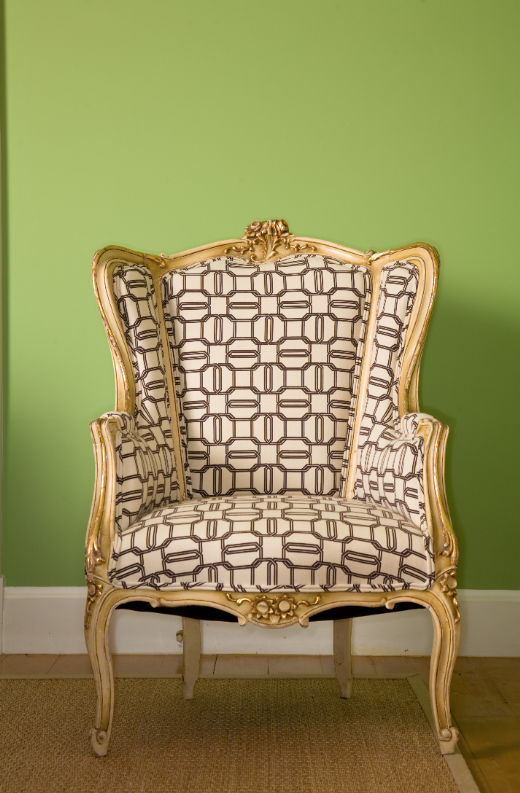
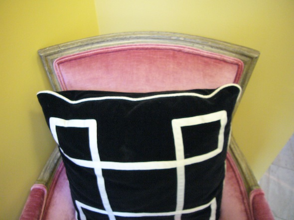
This chair with Kelly Wearstler’s Emerald cut fabric inside out, looked okay against the creamy yellow wall. But I knew it would get a revival against a stronger wall color.
When we shot it for the Washington Post I put it in the green dining room…
Image Benjamin Tankersley
So the color would pop.
So I knew a strong color was going to be great. Just needed the right tone.
I selected 1-3 hues, bought samples, and had them painted on the wall. It’s hard to tell what a color looks like unless you paint real samples, which I highly suggest! In this case my first love was the darkest tone, but I needed to paint lighter tones to make sure I would not make a mistake.
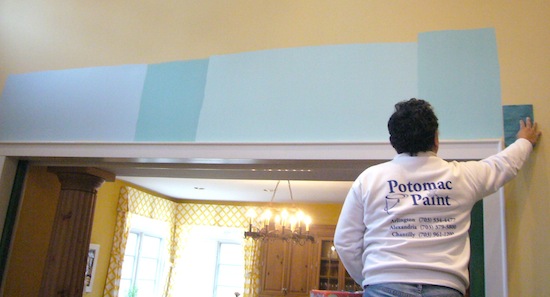
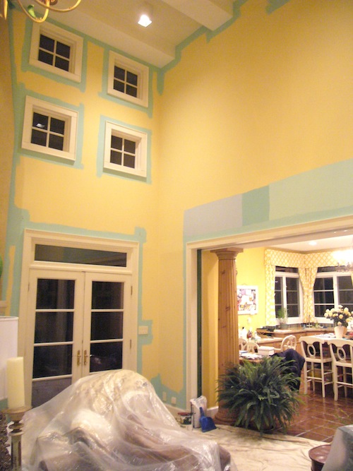
We painted the samples where I can see how they will look from the room to the next. Here we look in to the foyer. I picked four colors in varying degrees of aqua.
We painted samples on the other end of the room as well, looking in to the kitchen. Here I even mixed a lighter tone and a darker tone 50/50, (all the way to the right) thinking perhaps that would lighten the darker tone I liked the most. (second from left) I mix paints all the time!
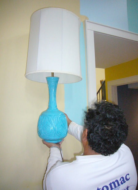
Then I had poor Jose, or whatever unlucky person was around, hold up stuff that would go in the room, so I could see how the colors looked together. I can get pretty obsessive doing this, so watch out if you’re visiting during times like these…
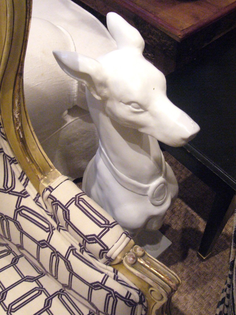
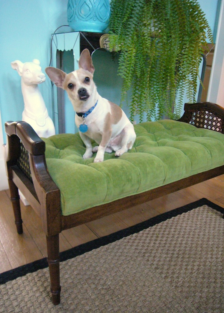
I knew if I picked the darker tone anything with white it in would look more interesting. Like for example my Homegoods dog.
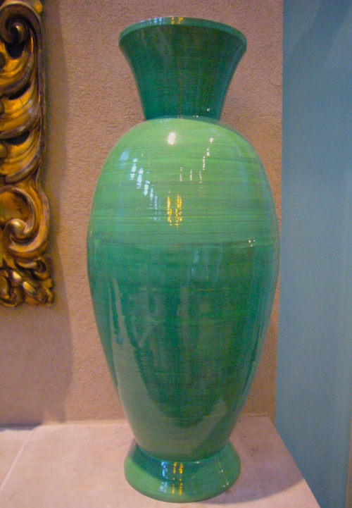
These green expensive ($ 20!?) Homegoods urns represented another color I wanted in a room so a sample was painted next to them. No one would guess the price tag when they’re next to a fancy painting. But of course I always have to tell everyone…
I like to draw in colors as accents from neighboring rooms. So I had to see how I liked the color with my other Homegoods steal -the red dragons.
The day we started to paint it was snowing and raining, and everything was very DARK.
So I selected the 50/50 mix worried about going too dark, although I loved the darker paint color. I figured if it was too light, we could do the second coat in the darker tone.
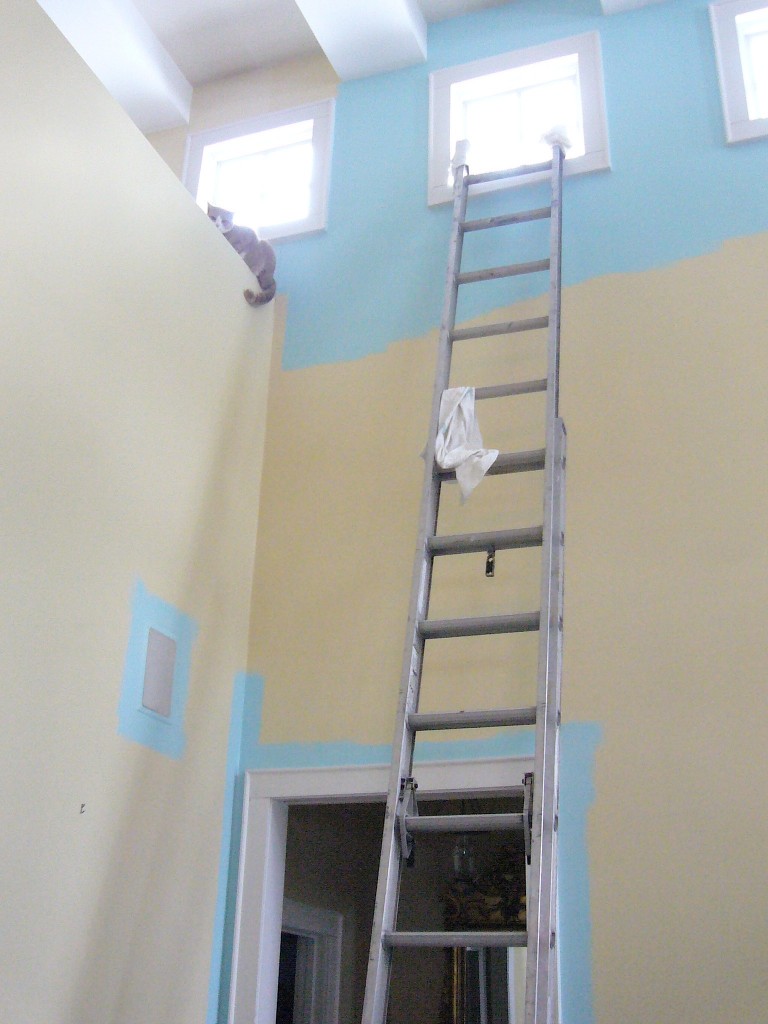
We then started to paint. Or I should say, Jose started to paint! This room is dangerously high to paint. As soon as I look at that latter I think 911.
The next morning our cat Bellybutton got so excited about all the activity he had to climb up on a ledge (I was dying..) and check it out.
With the sun shining in the paint color looked too light and too bland. But I had Jose finish a coat anyway. Then I let it dry. Always review your paint color selection in different lights and when it has dried completely!
I finally went with the second coat in which was my first instinct. It needed to be bolder and more aqua. I usually end up with the first sample I pick. But always good to make sure.
And can I tell you – WE LOVE OUR NEW PAINT COLOR!!!!!
I like how the colors in the foyer, the yellow, pink, black and soon red chandelier work with our…
…new aqua/turquoise living room!
HERE IS A TINY SNEAK PEAK…
It looks good with white, mirror and the dark turquoise lamps…
…and our beige zebra print chairs.
…the upcoming color scheme…
…and it even looks good with Bubba! Hey it all has to match right?
Sorry for being a bit long winded explaining it all!!












Turquoise make your living room really relaxing and graceful.
I do not know what to mention besides that i have enjoyed analyzing. quality website. i can preserve touring this internet site very often.