I think a lot about color. Perhaps too much when it comes to design. A muddy or bad color combination somewhere can make me crazy, even make me depressed! But I think colors affect us WAY more than we realize. For me it’s undoubtedly the most important part of a design. When I enter a room, I see the colors first, then the furniture. Colors don’t have to be strong to have an impact on you or completely alter a design. Lately I’ve been interested in colors that are barely there. These images have a barely there pink, yet it has a huge impact on the design.
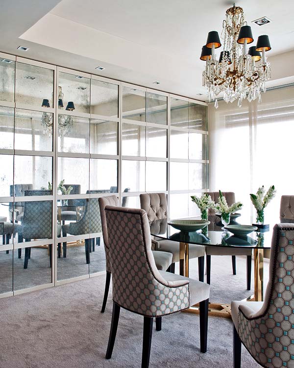
The pink in here is barely there, yet this room would have a completely different feeling if the walls where white.
(Next three images via FullHouse blog.)
There’s only a slight hint of pink in the carpet and the chairs, which makes the mix with turquoise so excellent, and adds a dreamy feel to the room.
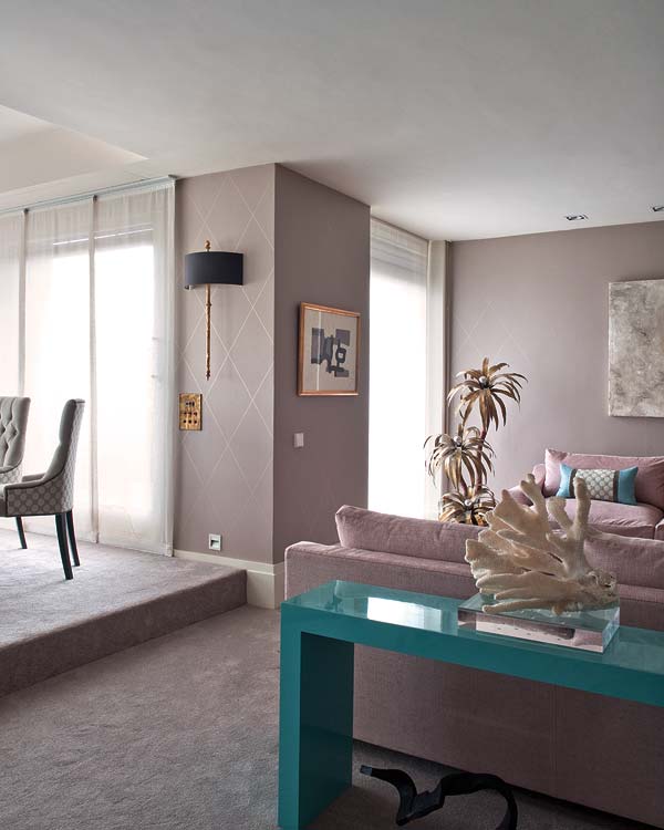
The barely pink in the carpet and walls, makes for an interesting combination with a bolder pink couch. With that slight a tone you can add any color I think.
It’s the hint of pink that creates the magic with the teal console. What if these walls and carpet had been gray? The room would have a completely different feeling, and would not have been so memorable. Yet the difference in tone is ever so slight.
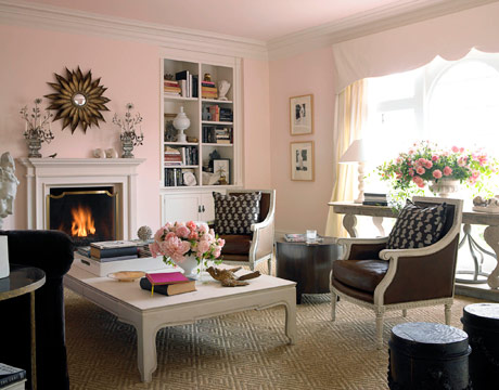
The pale pink gives the room an instant charming feel without really being there.
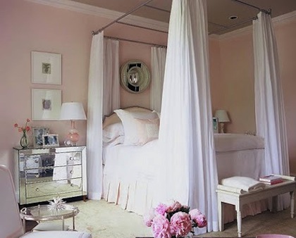
Again, the palest of pink adds a warm, feminine touch to this room.
Do you have any favorite barely there paint colors you can share here? I would love any suggestions!







I love this post because this is the color scheme I just picked for my new decorating blog…I think you have beautiful taste, so I'm glad you approve! 🙂
Thanks Sarah! Your blog looks beautiful!
I agree, color is huge. I think about it all the time as well. It affects mood, ambience and light in such subtle ways. I usually steer clear of pink in all but young girls' rooms, however, you make a good argument for it. I may give it more of a chance next time I am designing a room.
Looking back to your Jan 21st blog on Neutral Elegance, I like the use of the monochromatic color palet with one touch of color. It's calming, yet the splash of color keeps it vibrant.
Love these rooms – so pretty. Agree, love "barely there" colors too and have used in the past (just can't recall exact color names).
I love the floor treatment in the first pic. Is it stain?
Hi, I unfortunately don't know the source for the image. I looks like a dark stain on some kind of distressed wood. if I find the designer I will let you know!! I agree I love the floor.